While Microsoft is still working on the first stable version of its Windows 11 operating system, some features of the upcoming version of Windows appear set in stone already.
Windows 11 ships with a centered Start menu by default, and all icons placed on the taskbar are centered as well. The centering of content is not a novel concept, as plenty of third-party solutions, such as Center Taskbar, Taskbar Dock, or FalconX, and Apple with its Mac OS provide centered solutions as well.
Windows 11 users may align the Start menu to the left if they prefer that. If you take a closer look at Windows 11's taskbar, you will notice that it lacks functionality that previous versions of Windows support.
One of the first things that you may notice is that you cannot change the position of the taskbar anymore. The only location that is available is at the bottom of the screen. Gone are the times of placing the taskbar on the side or at the top. Microsoft did not comment on the decision, but one possible explanation is that the other designs interfered with the new centered position of the Start menu, and that the removal of the options was the cheaper solution.

Sidebar positions, just like sidebar tabs in browsers, are useful on widescreen monitors among other things.
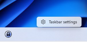
Taskbar positions but the one on the bottom of the screen are gone, but that is not all that has changed. Right-click on the taskbar and you get a single option to open the taskbar settings.

The menu lacks all the other options that users of Windows 10 and previous versions of Windows have at their disposal:
- Lock the Taskbar
- Cascade windows
- Show windows stacked / side by side
- Show the desktop
- Open the Task Manager.
- Show various buttons, toolbars and interfaces.

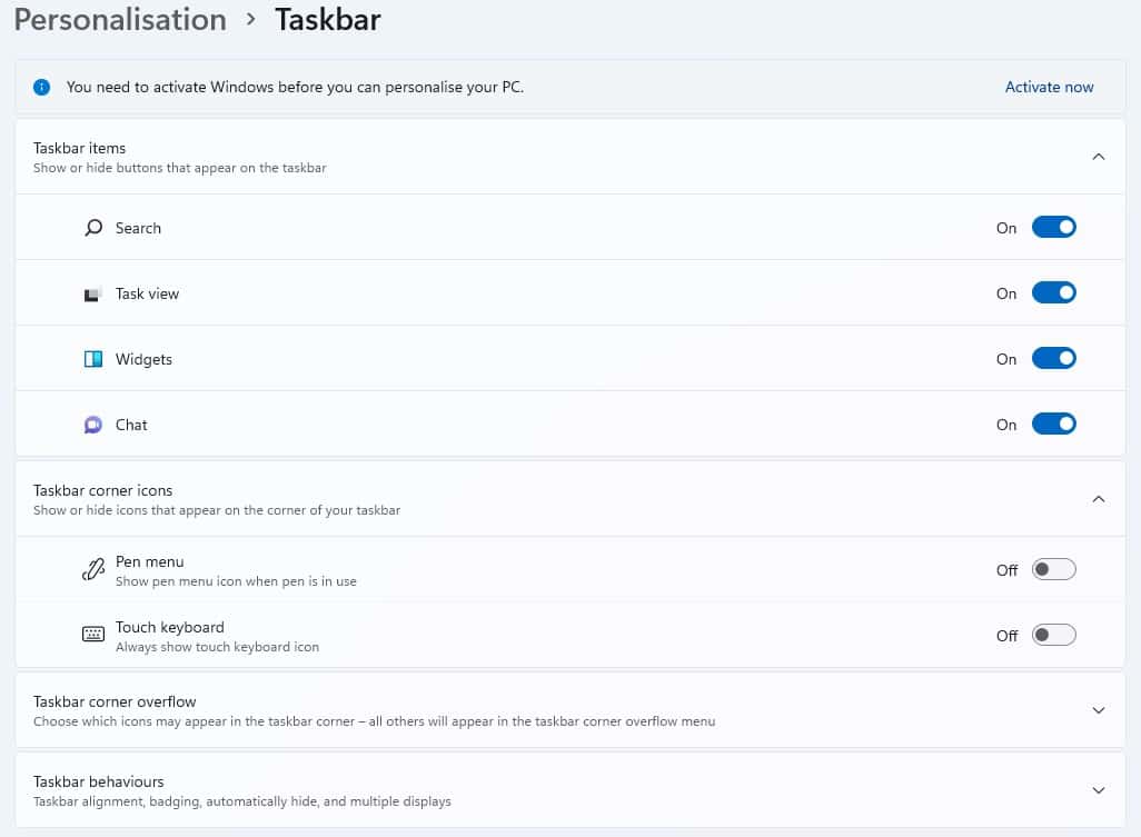
Some options are now available exclusively in the Windows 11 settings, others, such as the ability to arrange windows or create toolbars are missing entirely.
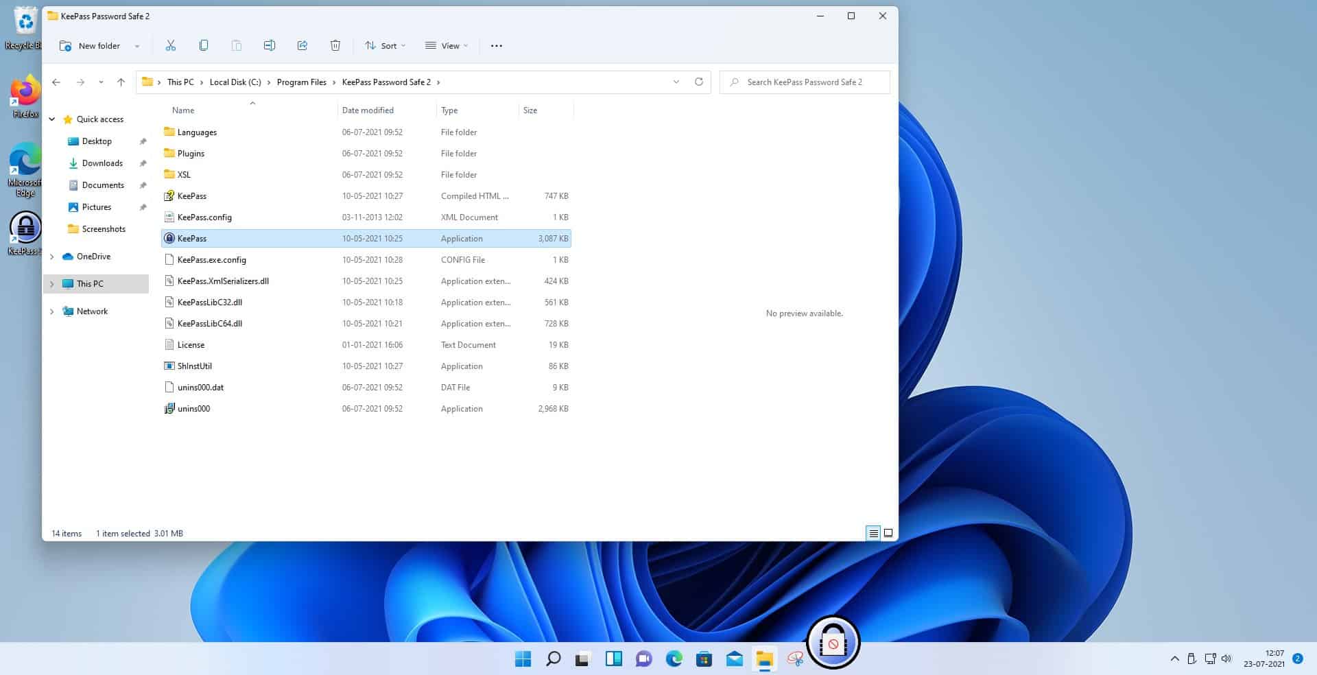
Another feature that Microsoft removed in Windows 11 is the ability to drag & drop shortcuts on the taskbar. When you try to do so on a Windows 11 system, you get a "denied" icon and can't complete the operation.

Granted, Windows 11 is still in development and some things could be changed by Microsoft before release, or after release. While that is a possibility, it is likely that Microsoft will go ahead with the function-reduced taskbar in Windows 11. Features could be introduced if there is enough user outcry.
Closing Words
Removing features from a product is often a surefire way of creating outrage. Microsoft removed several features from the Windows 11 taskbar, and this will annoy at least the users who used the features in the past.
Now You: do you use any of the removed features?
Thank you for being a Ghacks reader. The post Microsoft crippled the Windows 11 Taskbar appeared first on gHacks Technology News.
Post a Comment